
THE FOUNDRY
Secret Type Club is a Southern California–based type foundry devoted to the craft of letterforms and the art of typography. Founded by Catherine Realce, the foundry develops original display typefaces shaped by form, function, and character. The foundry is boutique in curation, independent in spirit, and deliberate in perspective.
Secret Type Club serves designers and storytellers who build worlds for a living, and the independent creatives who build them for the love of it. Not defined by title or industry, but by sensibility. Fellow storytellers who know that type is never just functional. Typography has a voice, conjures a mood, and creates an atmosphere.
Each typeface in the collection is born from a distinct origin, carrying its own personality, and was designed for the moments when a single word needs to carry the weight of an entire world.
THE FOUNDER
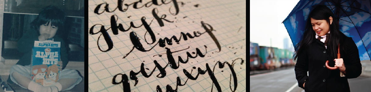
Most origin stories begin with a decision. This one begins with a dictionary.
Before there was a foundry, there was a red heirloom dictionary anchoring a shelf, with the family name Lorenzo inscribed in calligraphy on the top edge, penned by her father’s hand. A quiet act of craft that a six-year-old Catherine noticed and never forgot. At the age of 10, her 5th grade teacher introduced her to the art of calligraphy and taught her how letters could flourish. Throughout her college years, the margins of her notebooks were filled with doodles of letterforms and logos. Typography was never just a tool. It was a private obsession.
And then, around the time she acquired her first letterpress, she discovered an image in her mother’s photo collection. It was of her four-year-old self, sitting criss-cross on her kitchen countertop, eating Alpha Bits cereal for breakfast. Typography, quite literally, for breakfast. It was a beautiful coincidence that felt almost fated.
Turns out, Catherine had been a member of the Secret Type Club long before the club had a name.
Catherine Lorenzo Realce is a multi-disciplinary Creative Director and Designer with more than twenty years of experience translating abstract ideas into tangible design. Her background spans creative direction, brand and campaign leadership, experiential and entertainment design, and interactive storytelling, including work with emerging technologies. Typography has long been a central thread in her practice, expressed through the development of custom typographic systems and letterforms across brand and entertainment projects.
Catherine’s work has been featured in publications including The Vandercook 100, LogoLounge Book 4, Did You Read That Review?, and Exquisite Weddings by San Diego Magazine, among other editorial features and exhibitions. She holds a Bachelor of Fine Arts in Visual Communications from California State University, Long Beach, a Master of Arts in Design Strategy and Innovation from Rocky Mountain College of Art and Design, and a Master of Fine Arts in Game Design from Laguna College of Art + Design.